Decorating with Colour and Pattern
- Kerri Hansen
- 23 hours ago
- 6 min read
Last week I had the honour of being the Guest Presenter at a Design Workshop at my local Urban Barn store in West Vancouver.

An Urban Barn Design Session is a complimentary in-store event where local design experts share home styling tips and inspiration. These Design sessions happen right across the country, so there are a handful of designers just like myself co-hosting events at selected stores. This is my third time co-hosting one of these Design Sessions in the past year and I truly enjoy collaborating with Urban Barn. It is one of my favourite places to shop for both myself, and for clients because of their beautiful and afforable home decor. The topic I was asked to speak about this time around was "Mixology 101: Decorate with Colour & Pattern". The Urban Barn Design team always shares a Presentation Directive with guidelines and suggestions for what to share. I used their guidelines to craft a presentation to share with the attendees and I thought I would share that with you here on my blog as well!
I created a handout to share with the attendees, which helps illustrate the highlights and takeaways of the presentation and theme.

Introduction:
When creating a room design, there are several important design principles that we as Designers and Decorators take into consideration. These principles are essential to creating stylish and harmonious spaces. The fundamental design concepts I covered related to using colour, pattern and texture to create rhythm and flow in your home. This is quite a dense topic so I decided to break it into two Blog Posts. I am going to teach the foundations in this post, and talk more about practical applications in part two! So settle in class, school is in session!
Basics of Colour Theory
Colour theory is a basic foundational concept in the world of art and design. It basically explains how colours interact with each other and how to combine them effectively. Colour is a very important element in home styling and interior design. It is also very personal, and every homeowner has different preferences for what colours they like and how much colour they want to use. In my presentation I asked for a show of hands for who resonated with the following statements:
I love colour, the more the better!
I like colour in moderation, paired with a neutral backdrop
I don't like any colours in my home decorating, neutrals are my jam!
It was interesting to see the response from the crowd, and statement #2 saw the greatest show of hands.
The Colour Wheel
The colour wheel is a visual tool used to understand how colours relate to each other. It can help you to select a colour palette for your home decorating project. The colour wheel consists of primary colours (red, blue & yellow) and the combinations thereof. Confession: I don’t use the color wheel when I am creating a room concept.At all. I choose colors based on personal preference and what I think suits the vibe of a room. I love a balance between neutral foundational pieces mixed with colourful accessories, but we will dive more into that later! The colour wheel is worth mentioning because it can be a helpful reference in certain situations.

Temperature
Colours are considered warm or cool and this is an important aspect because it determines the atmosphere in a room. Warm colours are red, yellow and orange and these colours are descbribed as being both cozy and energetic. Cool colours are blue, green and purple, and these colours are thought to be calming and peaceful.
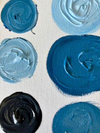
Tints, Tones & Shades
What I love about colour are the different variations you can get by mixing a colour, or hue, with white or black.
Colours can be modified into tints, tones and shades as follows:
Tint= Hue + White
Tone=Hue + Gray
Shade= Hue + Black
To help the audience understand this principle and have a little fun with the subject, I handed out mini pallettes and paintbrushes and had the participants explore creating tints, tones and shades out of the colour blue. It was so fun! Here are some photos of the trial run I did at home:


Colour Schemes
A color scheme is a set of colors that are carefully selected to work well together. It helps guide decisions around:
Wall paint
Furniture
Textiles (curtains, rugs, cushions)
Artwork and accessories
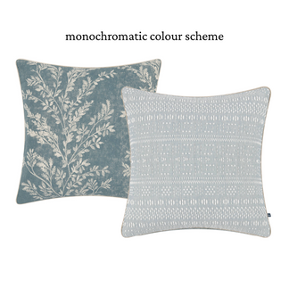
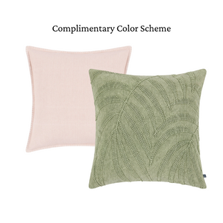
In colour theory, the common colour combos are:
Monochromatic: One color in varying shades and tints (elegant, minimalist)
Analogous: Colors next to each other on the wheel (harmonious, cohesive)
Complementary: Colors opposite each other (high contrast, bold)
Triadic: Three evenly spaced colors (vibrant but balanced)
Neutral with pops: A neutral base with bold accent colors (modern, dynamic)
In my presentation I showed a few examples of colour combinatinos using throw pillows!


With the basics of colour theory explained, the next part of my presentation focused on how to chose a colour scheme for your interior styling. When clients look to me for help with choosing a colour scheme for their interior styling, I have a few strategies to help guide the process. There is a large overlap between fashion and home decor, and the types of colors (and patterns) we put on our bodies can often translate to how we decorate our homes. Here is a good example of this, and I swear it was not intentional - the dress I wore for the design presentation just happened to match the items I pulled for the styling demonstration. No surprise, because I love the colour green!

The useful tool I use time and again is Pinterest. I always encourage clients to pin as many images as possible of whatever room we are working on, so that I can see their style and colour preferences. Pinterest is honestly the best!

The other tip to share is to find a "jumping off point". And by that, I mean find something you love and use it to guide your colour selections. It could be a piece of artwork, a wallpaper pattern, or a fabric swatch. For example, I love this Spring Pillow from Urban Barn:

You can see that there are several colours in this pattern and you can pull the colour or colours that you like out of the pattern to create some pillow combinations.

Using Patterns
And speaking of pattern, this is another important design principle that I touched on in the presentation. Using pattern brings personality, depth and visual interest to any room. My favourite way to introduce pattern is through textiles and wallpaper. I created this little flat lay vignette to illustrate how you can combine different patterns, and you will also see that I used the wallpaper as my "jumping off point" just like with the Posie pillow from above....I pulled a few colours from the pattern and used them to coordinate textiles.

Mixing patterns can feel a bit daunting, as there are so many types and they range in colours. A simple recipe I use time and time again is to combine a plaid or stripe with a floral or organic pattern. The two work beautifully together every time! The flow and movement in a floral pattern contrasts well with the structure of straight lines.

Texture
Another important element to consider when decorating a room is texture—the quality of a surface as it feels to the touch. Texture reminds us that great design isn’t just about what we see; it’s also about what we experience. When I think about texture, I imagine a mix of fabrics like leather, bouclé, and velvet; surfaces such as marble and wood; and woven materials like rattan. Layering different textures adds depth and richness to a space. It’s especially important to focus on texture if you prefer a neutral colour palette, as incorporating a variety of tactile elements will help prevent your home from feeling flat or boring. I love this photo from Studio McGee - while the colour scheme is quite neutral, you can see so many different textures at play, creating a cozy, layered and super stylish room!

Rhythm
The last design principle I shared with the audience at the Design Session addressed the importance of rhythm- creating a sense of visual flow and movement in a space. It helps a room feel balanced, cohesive, and easy on the eyes. We aim to create rhythm within individual rooms and also through an entire home so that everything feels connected. The easiest way to create rhythm is to repeat the different elements we have touched on - texture, pattern and colour - throughout individual rooms but also homes as a whole. I refer again, to the image above of the bedroom designed by Studio McGee. You can see repetition of colours and textures and notice how it invites your eye to move around the room.
Conclusion
Well class, that concludes today's lesson on the fundamentals of colour, pattern and texture! I hope that you have learned a bit about the design process and how we use basic principles to guide our styling decisions in the design world!
My goal in the presentation I delivered at Urban Barn was to touch on the basics but then show how to bring everything all together and put them into practice when shopping for dome decor. Stay tuned for my next blog post where I will share the details of the hands-on demo I did and share a room design created using these principles.
Thanks so much for reading!
Kerri


Comments